In my previous blog, I discussed on how to apply rules to the elements and how to implement theme. In the current blog, I’ll discuss on Style a component, an elements and customize the theme.
In XM Cloud Components, themes are managed in the Styles builder, allowing you to apply them to components with a single click.
In a previous blog, I explained that themes consist of pre-built elements and style rules, designed to simplify the styling process by applying multiple styles at once.
How to Style a Component Using a Theme:
- In the Components library, select the component you want to style.
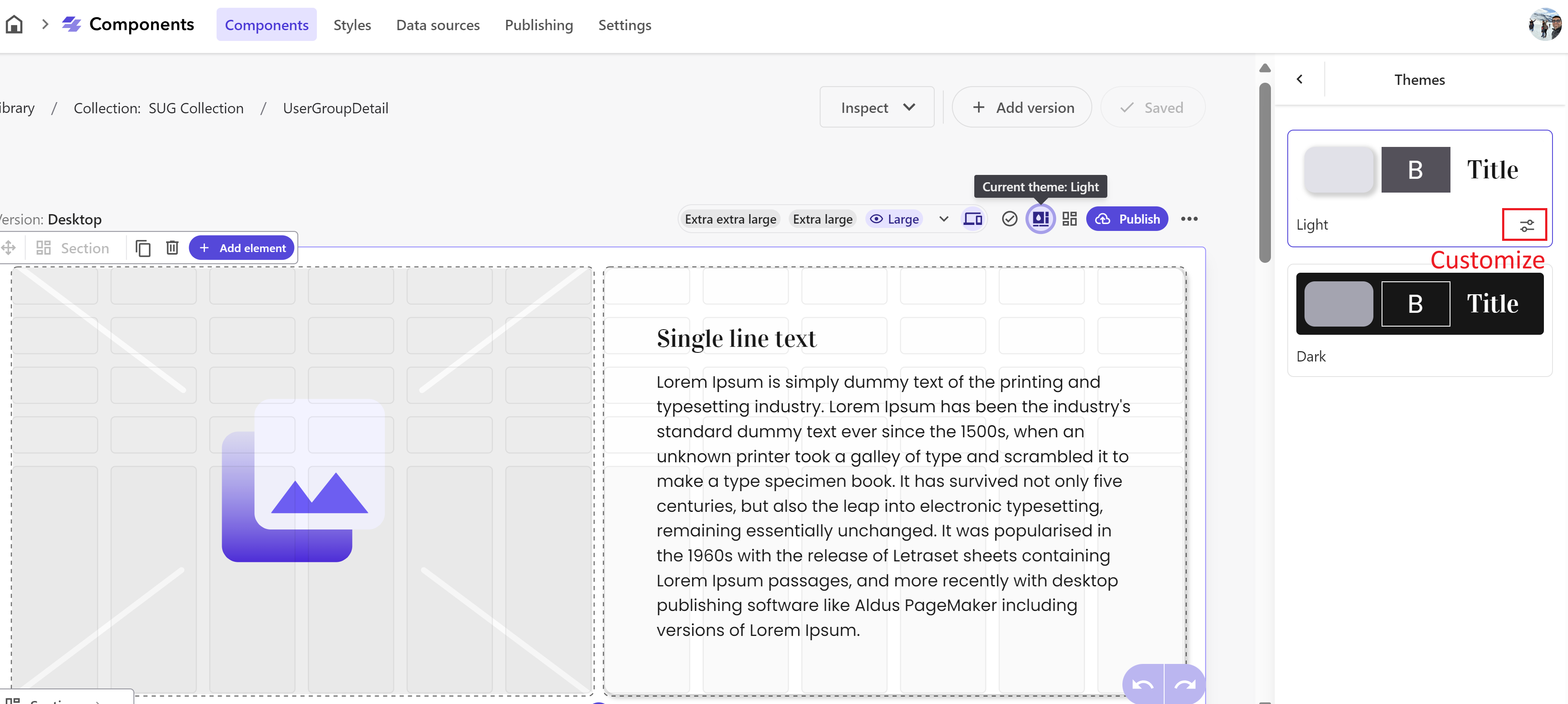
- In the Components builder, locate the version you want to style and click Current theme in the top-right corner.
- In the right-hand panel, under the Themes tab, select the theme you wish to apply.
- The component will now be styled according to the chosen theme.
Customizing a Theme
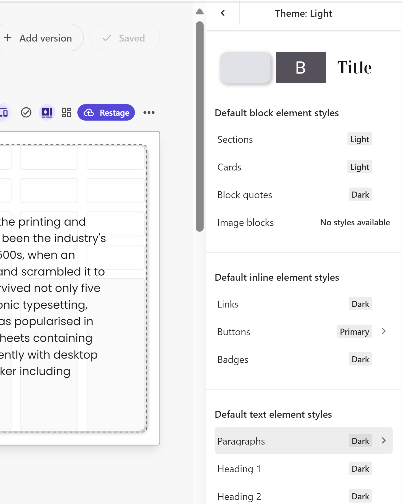
You can tailor a theme by selecting alternative styles for certain categories of elements. This is possible only if the theme includes pre-configured alternatives to the default styles. You can access these alternative styles by clicking the right arrow in the theme picker.
To customize a theme for a specific component version:
- In the Components builder, select the version you wish to customize.
- In the top-right corner, click Current theme.
- In the right-hand panel, click Customize.
- Select the right arrow for the element type you want to modify.
- From the Allowed styles list, choose the style for that element type within the component.
- Customized styles are highlighted in light green in the Element customization overview.
Please note: The customization only applies to the current theme and component version. Changing the theme will remove all customizations, and they won’t be transferred to other components or versions using the same theme.
Styling a Single Element and Text
In XM Cloud Components, elements are assigned one or more styles from the Styles library. When an element is used in a component, it automatically adopts the default style assigned in the Styles library.
Styling a Single Element
You can modify the style of a specific element within a component without altering the style of all similar elements in the component.
To style an individual element:
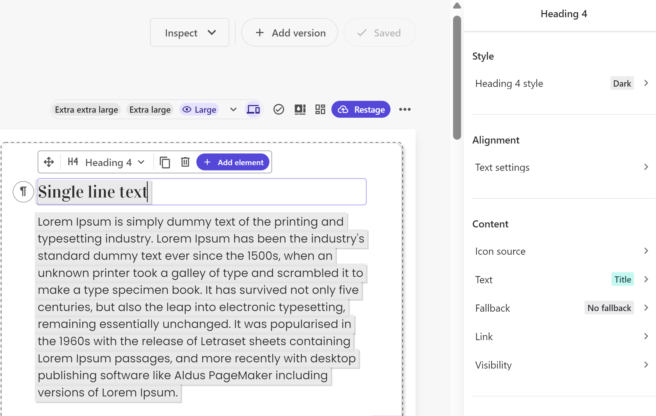
- In the Components builder, select the element you want to style by either clicking it on the canvas or using the context toolbar in the bottom-left corner of the component.
- In the right-hand pane, at the top of the Style section, click the style tile.
- To choose a new style for the element, click the top tile.
- In the drop-down menu, select one of the following options:
- Current theme: Access the styles allowed by the currently applied theme.
- All available: Access all available styles for the element, even those not assigned to the current theme.
- Click on the desired style to apply it to the selected element.
The element will now be styled according to the chosen style, either from the current theme or from any other allowed styles in the Styles library.
You can also detach the element from the current theme and choose a style from the All available list. If the theme is modified, an orange tag with a warning icon will appear next to its name. Further customization is possible through one-off adjustments.
Styling Text
You can style text by making inline edits or applying style rules defined in the Styles library.
To style text:
- In the Components builder, highlight the text you want to style.
- To change the text style:
- In the right-hand pane, under the Style section, click the tile to open the Styles picker and select a different style for the text.
- To the left of the highlighted text, click the dropdown and select one of the Text element tags. The styles associated with these tags are predefined in the Text blocks of the Styles library.
- To adjust text alignment, open the Text settings under the Alignment section in the right-hand pane.
Customizing an Element
Elements are assigned one or more styles in the Styles library. When used in a component, the element is styled based on the theme selected for that component. However, you can change the default style by selecting a different style from the Styles library or other available styles.
Customizing a Style
To customize a style by modifying one or more features:
- In the Components builder, select the element you want to style by either clicking it on the canvas or using the context toolbar in the bottom-left corner of the component.
- At the top of the right-hand pane, under the Style section, click the tile to open the Styles picker and select the style you want to customize.
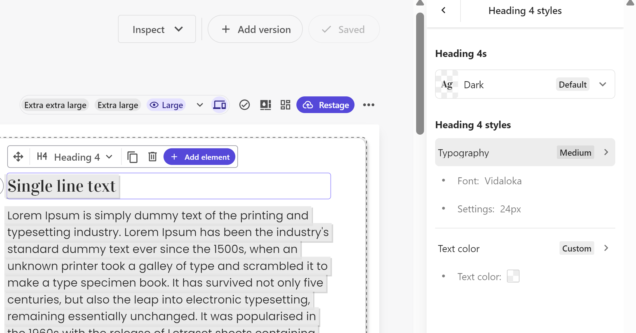
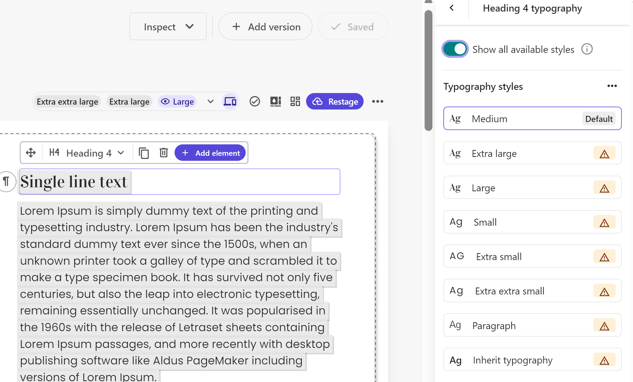
- To modify a specific feature of the style (e.g., Typography or Spacing), click the relevant option.
- Enable the “Show all available styles” option to view all styles built in the Styles builder. You can choose from additional styles assigned to the element or select any style from the library, even if not originally assigned. Note that using extra options will detach the style from the original element, indicated by a warning icon.
Creating a One-Off Customization of a Style
To create a one-off customization by configuring one or more features of a style:
- In the Components builder, select the element you want to style by clicking it on the canvas or using the context toolbar in the bottom-left corner.
- At the top of the right-hand pane, under the Style section, click the tile to open the Styles picker and choose the style you wish to customize.
- Select the feature of the style you want to modify (e.g., Typography or Spacing).
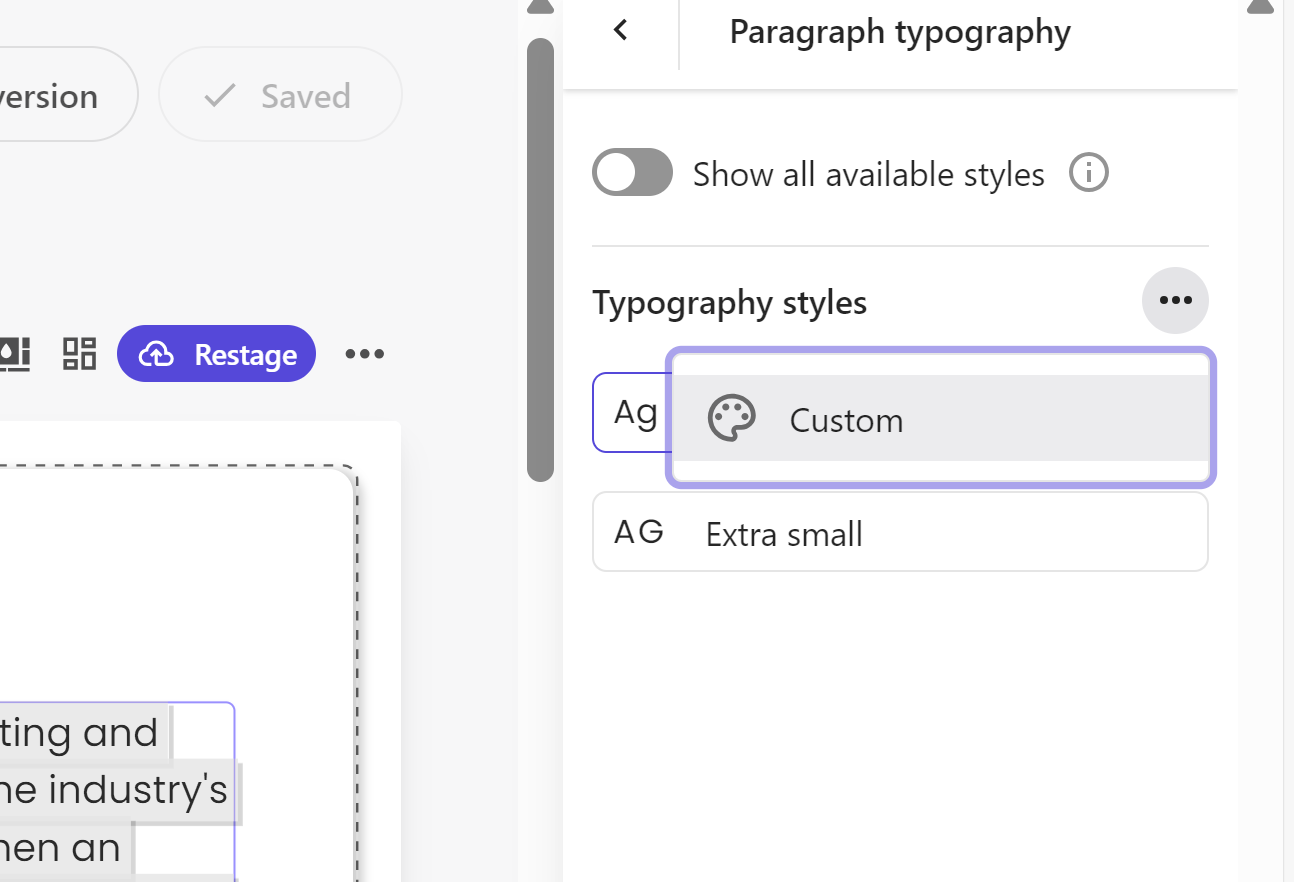
- Click the options menu (three dots) and choose Custom.
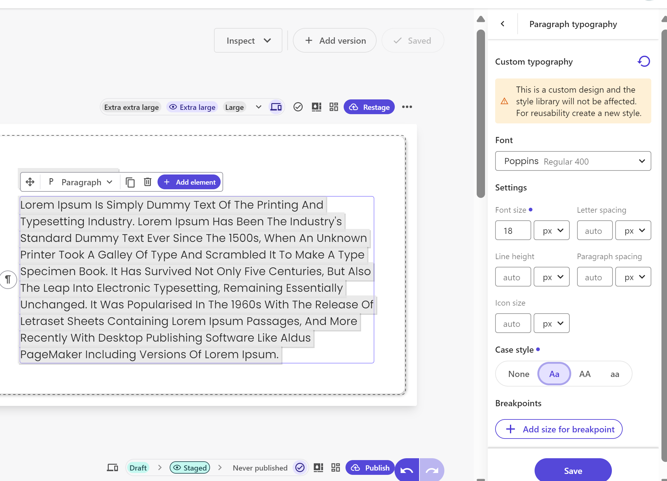
- The right-hand pane will display the configuration settings from the Styles builder, allowing you to create a one-off custom design.