Welcome back to our XM Cloud Component Builder series blog. In my previous blog of this series I discussed about how to create a component using XM Cloud component builder. In this blog we will begin with understanding what the Sitecore XM Cloud Components style library.
The Styles library and builder of XM Cloud Components is a design system that manages the styles of all components and their versions and ensures visual consistency across all your digital properties.
Define basic styling:
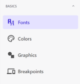
Fonts:
You can define and select fonts to maintain consistency and readability across your website.
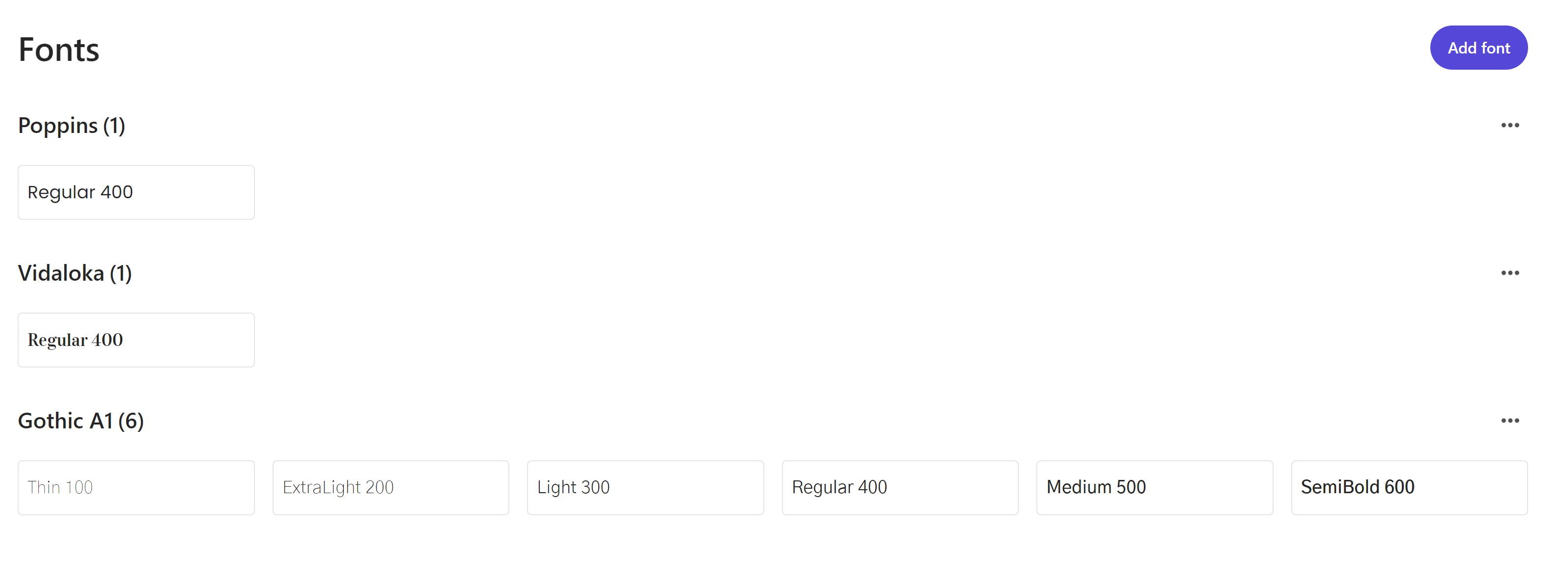
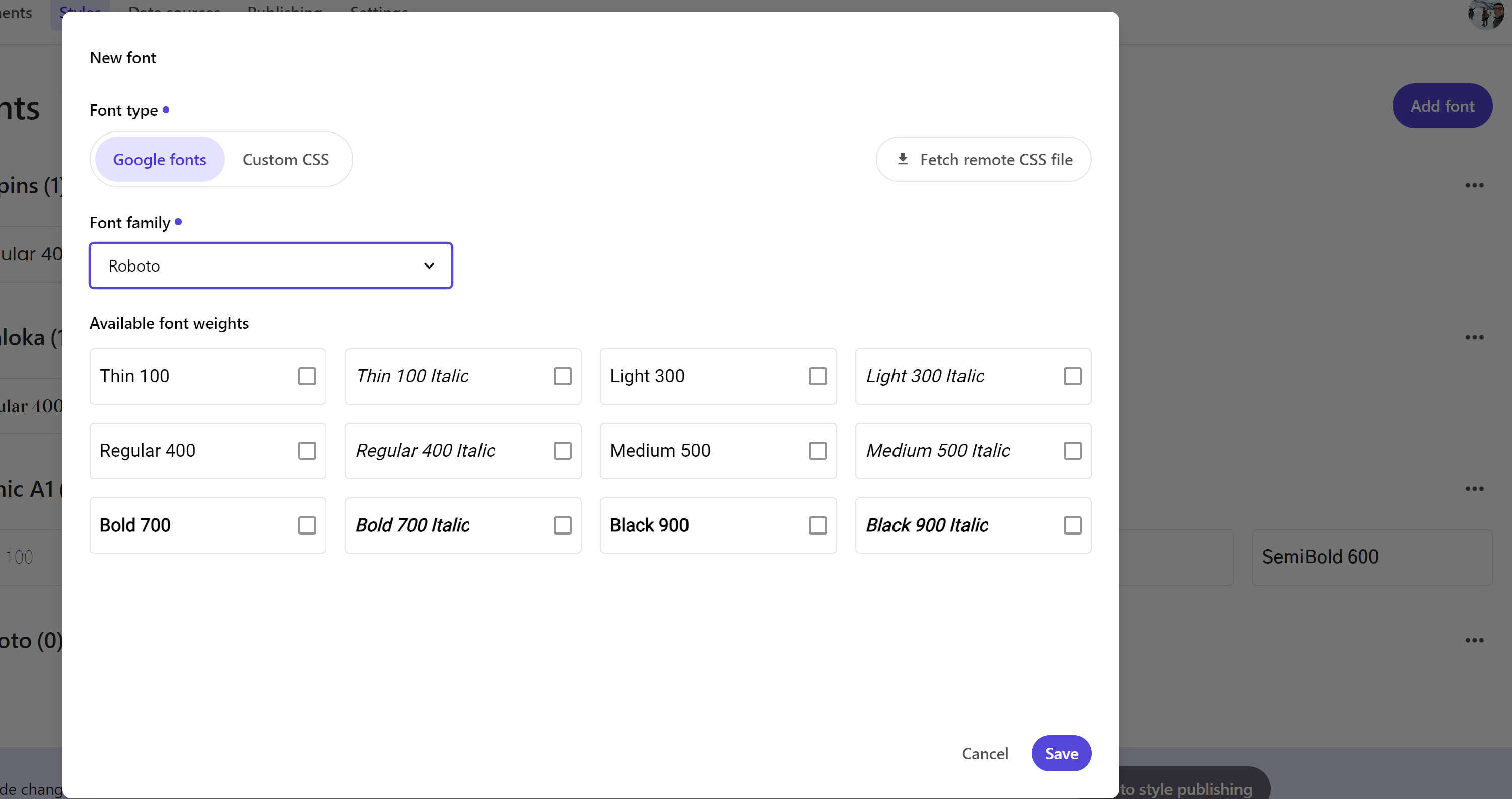
To add a font to the Style library, follow these steps:
- In the Styles builder, click Fonts in the left pane.
- At the top of the page, click Add font library.
- In the Font type field, choose either Google or Custom fonts based on your requirements. For custom fonts, you can upload them using the Fetch remote CSS file option.
- I’ll select a Google font family from the drop-down menu, then choose the relevant font.
- Select the desired font styles by checking the boxes under each style option.
Colors:
You can add the colors you want to use for your brand. It is recommended to create collections and organize colors within them for better maintenance and consistency.
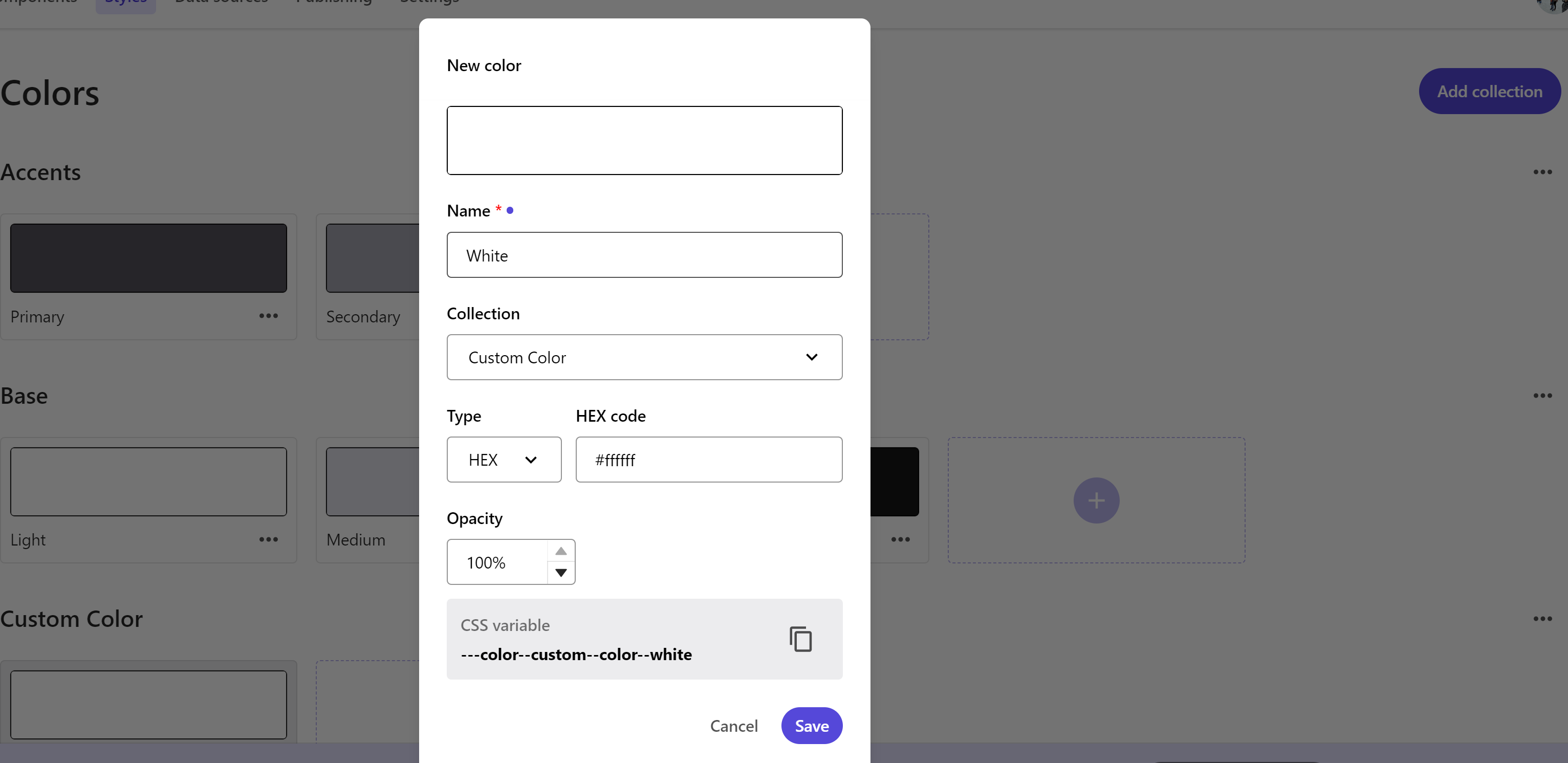
To create a new color collection:
- In the Styles builder, click Colors in the left pane.
- At the top of the page, click Add collection.
- Add with unique collection name and save.
To add a color to a collection:
- In the desired color collection, click Create.
- Assign the color a unique class name and confirm which collection it belongs to.
- Click the color input field (e.g., HEX or RGB) and enter the color value.
- Adjust the opacity as needed.
- Click Save.
Graphics
Defining graphics in the Styles Library ensures that all visual assets, such as logos and icons, are used consistently across your website. This helps maintain User Experience, Brand Consistency, and Optimized Graphics.
It is highly recommended to create collections and organize graphics within them for better management.
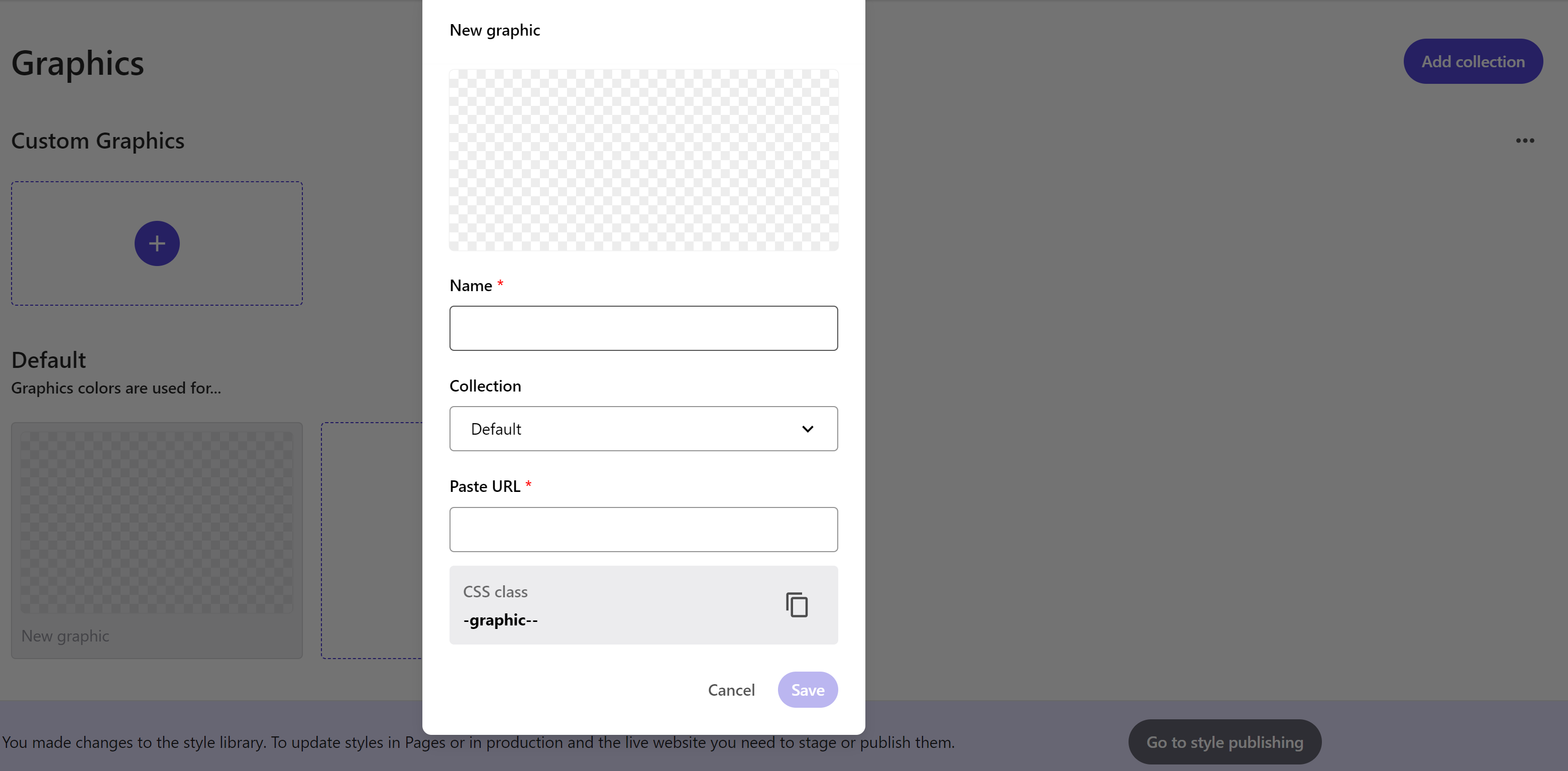
To create a new graphic collection:
- Navigate to the Graphics tab in the left Styles menu.
- Click Add collection at the top right corner of the page.
- Name your new graphic collection and click Save.
To add a graphic to a collection:
- In the desired graphic collection, click Create.
- Assign the graphic a unique name and confirm which collection it belongs to.
- Paste the image or icon URL.
- Click Save.
Breakpoints:
You can create custom breakpoints for your website and organize them into collections. Breakpoints are sorted from the largest to the smallest within each collection, helping you manage Responsive Design and User Experience effectively.
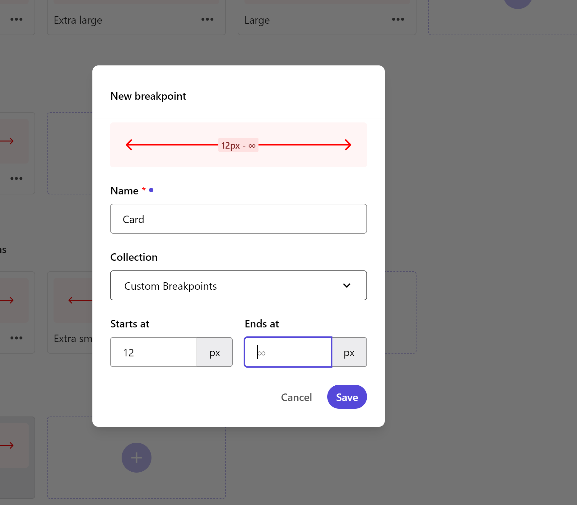
To create a new breakpoint collection:
- In the Styles builder, click Breakpoints in the left pane.
- Click Add collection.
- Assign a unique name to your collection.
- Click Save.
To add a breakpoint to a collection:
- In the desired breakpoint collection, click Create.
- Name the breakpoint (e.g., Large for big screens, Medium for tablets, or Small for mobiles).
- From the drop-down menu, select the collection the breakpoint belongs to.
- Enter the pixel values for when the breakpoint starts and ends. Ensure that breakpoints do not overlap, as this can cause issues with responsive components on a webpage.
- Click Save.
Style rules
In Sitecore XM Cloud Components, you can build style rules to extend design primitives and apply them to elements. Rules such as Typographies, Decorations, Fills, and Spacing utilize the basics (fonts and colors) you’ve previously added to the Styles library. You can also incorporate custom CSS styles into these rules.
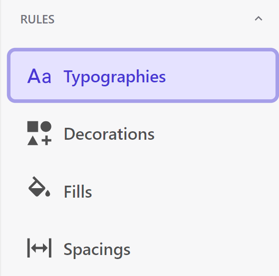
Typographies:
Typographies are extensions of fonts with defined sizing for each font type.
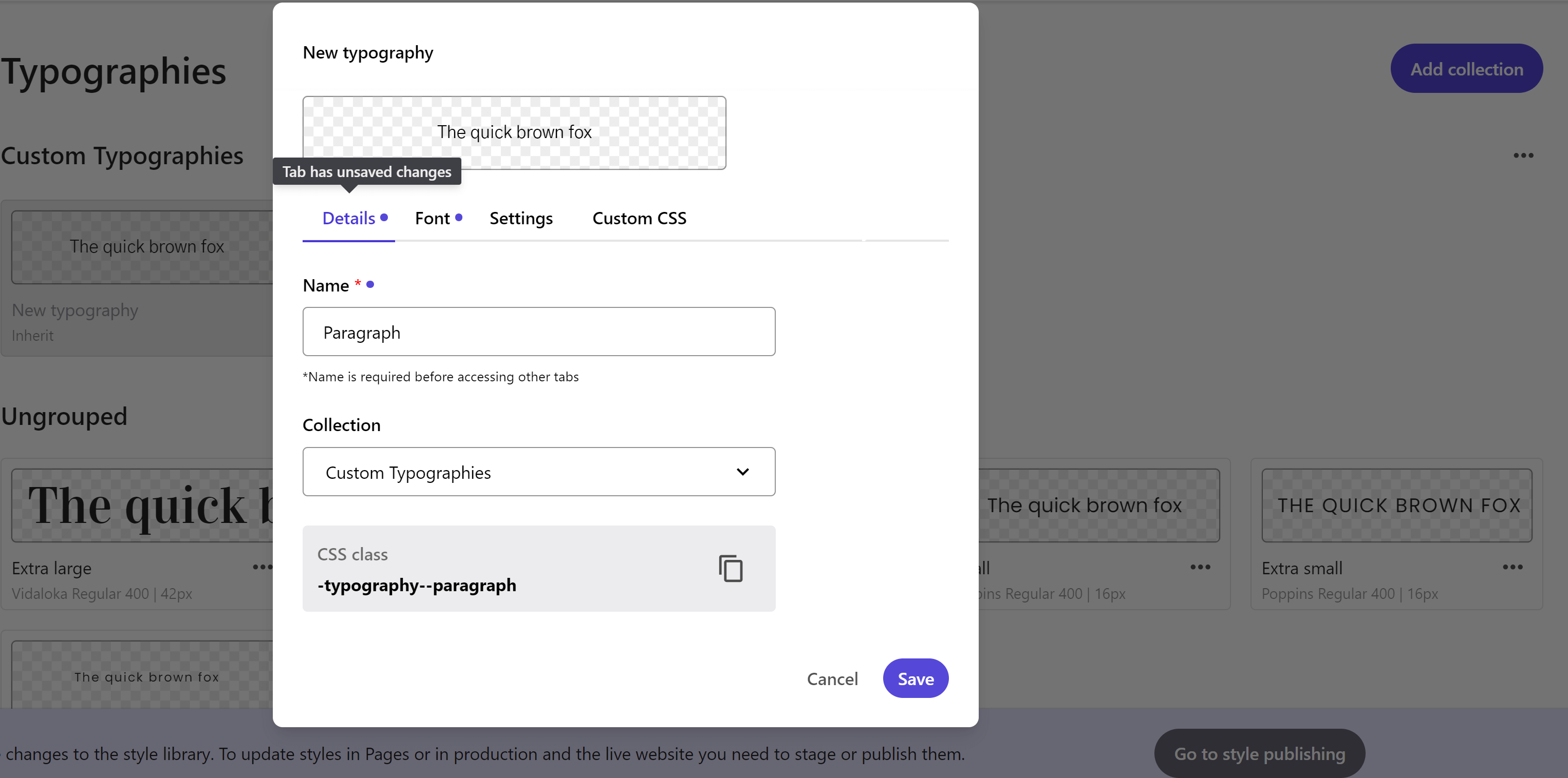
To create a new typography collection:
- In the Styles builder, click Typographies in the left pane.
- Click Add collection.
- Assign a unique name to your collection.
- Click Save.
To add a new typography:
- In the desired typography collection, click Create (+ icon).
- Enter a name for the typography (e.g., Article headline).
- On the Font type tab, select a font (only Google fonts are available).
- On the Settings tab, configure values for font size, line height, letter spacing, paragraph spacing, icon size, and case style. Set these values independently for different breakpoints.
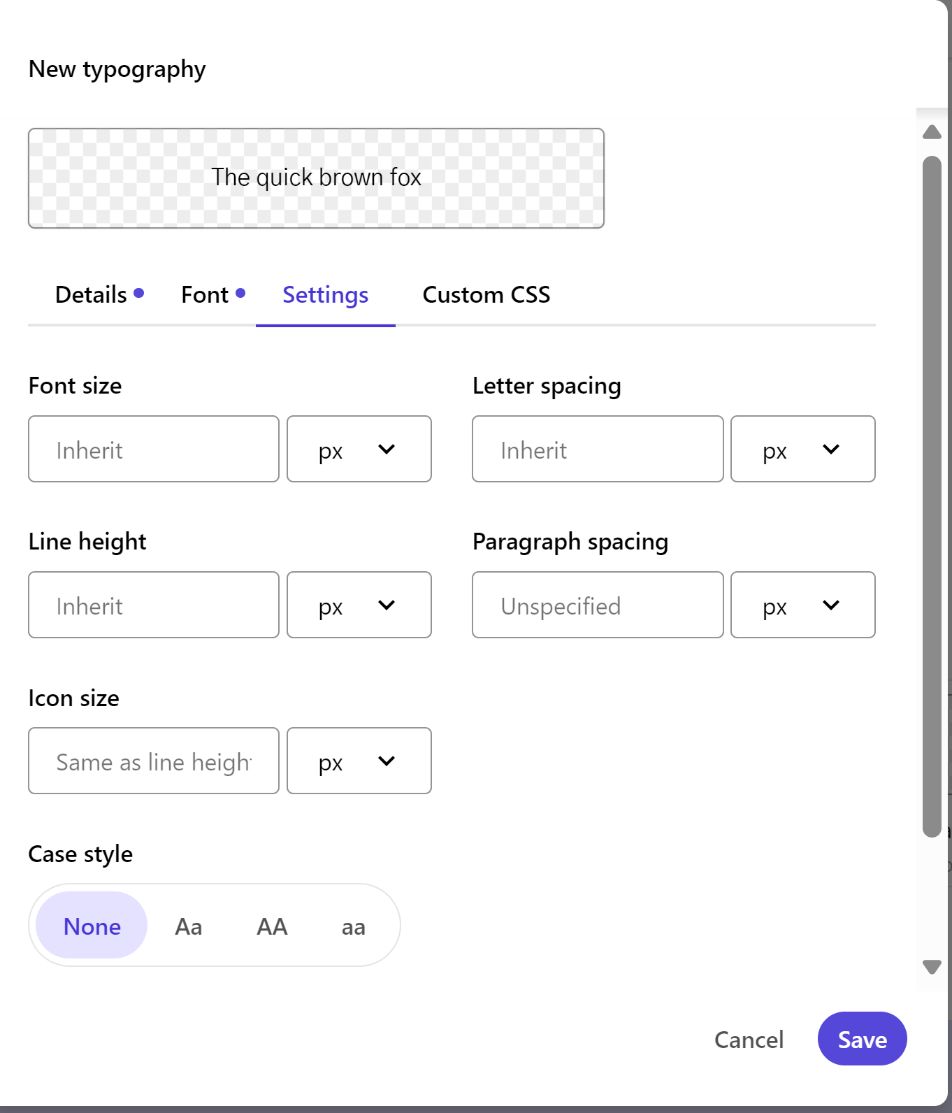
- Click Save to add the typography to the Styles library.
Decorations:
Decorations allow you to add visual accents like borders and drop shadows to elements and blocks.
To create a new decoration collection:
- In the Styles builder, click Decorations in the left pane.
- Click Add collection.
- Assign a unique name to your collection.
- Click Save.
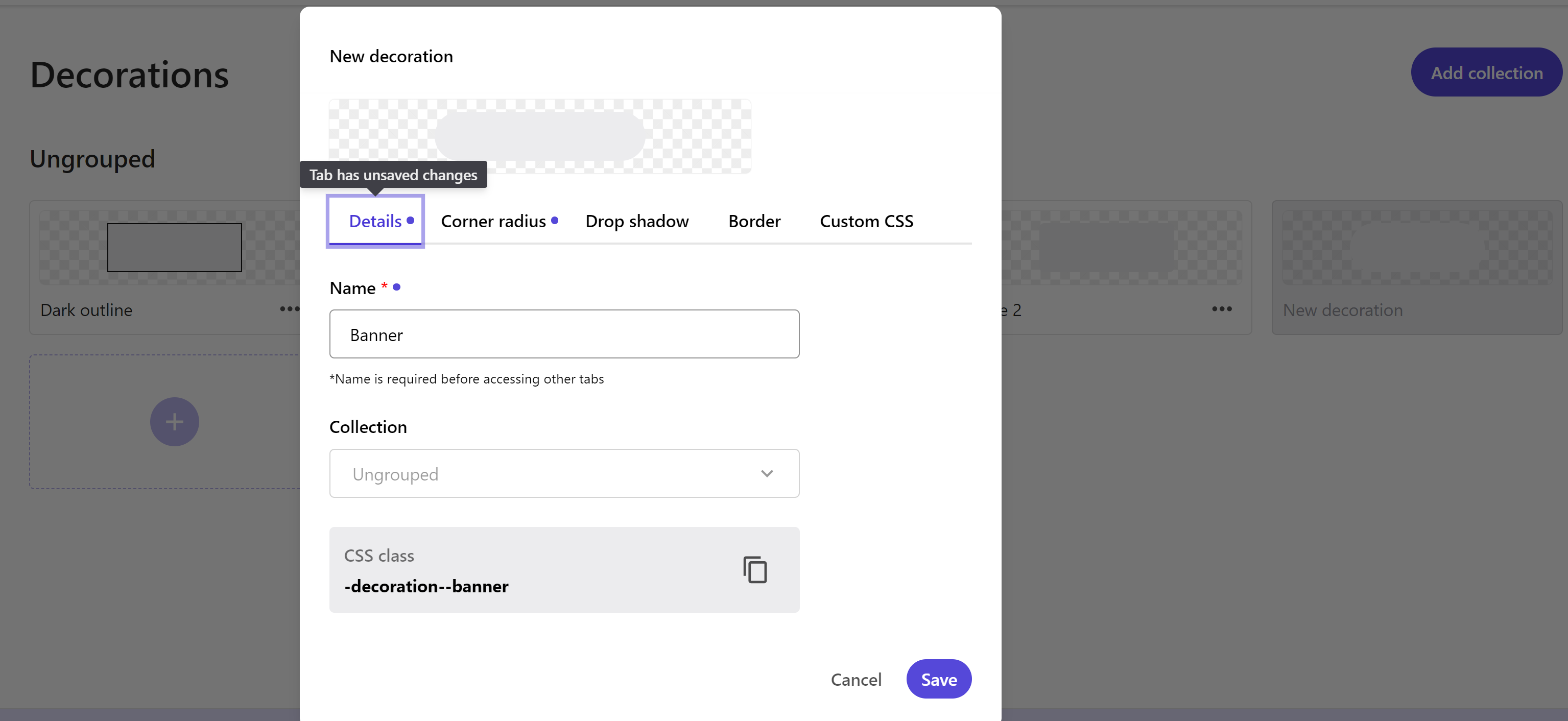
To add a new decoration:
- In the desired decoration collection, click Create (+ icon).
- Enter a name for the decoration.
- On the Corner radius tab, define rounded corners for elements and blocks.
- On the Drop shadow tab, configure shadows for elements and blocks.
- On the Border tab, add borders or border shadows to elements and blocks.
- Click Save to add the decoration to the Styles library.
Fills:
Fills allow you to add background colors or gradients to cards, buttons, or sections.
To create a new fill collection:
- In the Styles builder, click Fills in the left pane.
- Click Add collection.
- Assign a unique name to your collection.
- Click Save.
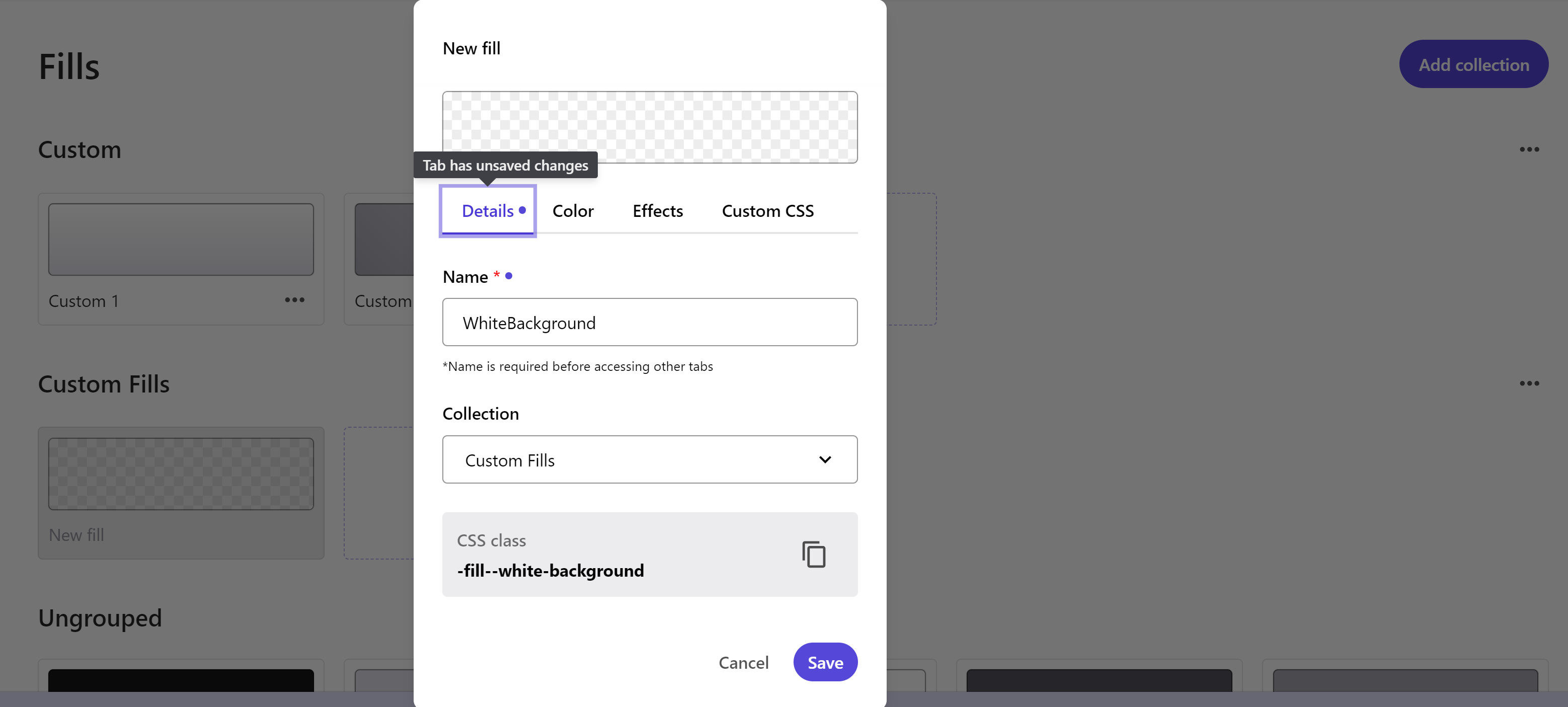
To add a new fill:
- In the desired fill collection, click Create (+ icon).
- Enter a name for the fill and select the collection it belongs to.
- On the Color tab, choose a previously defined color or create a gradient with options for the gradient angle and color opacity.
- On the Effects tab, set the blur intensity and opacity for the fill.
- Click Save to add the fill to the Styles library.
Spacing:
Spacing defines grid arrangements such as padding and gaps for layout components.
To create a new spacing collection:
- In the Styles builder, click Spacing in the left pane.
- Click Add collection.
- Assign a unique name to your collection.
- Click Save.
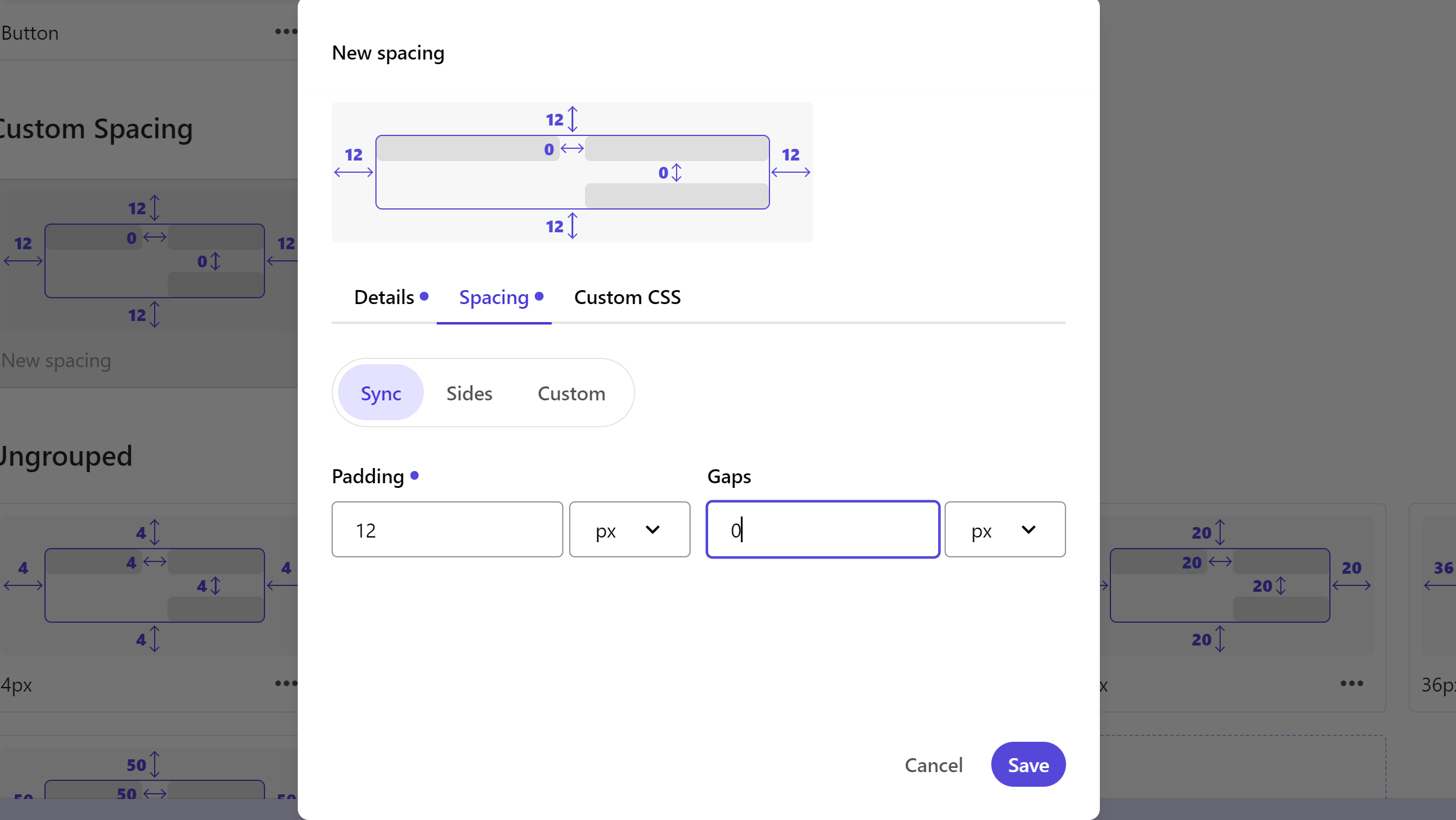
To add a new spacing rule:
- In the desired spacing collection, click Create (+ icon).
- Enter a name for the spacing.
- On the Spacing tab, define padding and gap values in pixels, percentages, em, or rem. Choose from the following options:
- Sync: Makes all padding and gap values the same.
- Sides (Vertical/Horizontal): Combines top and bottom or horizontal padding values.
- All custom: Customizes padding and gap values for top, right, bottom, left, vertical, and horizontal spaces.
- It’s best practice to set values for all three configurations to easily choose the one you need in the Components builder.
- Optionally, add custom CSS.
- Click Save to add the spacing rule to the Styles library.